These stunning hues offer the perfect inspiration if you’re looking to paint your bedroom.
Your bedroom is the one place in the house where you should put the most effort into creating the ideal setting. After a demanding and exhausting day, this place serves as your haven of peace and tranquility. Your choice of paint colors for your bedroom will immediately impact the atmosphere of the space and will determine the other decorative touches you use, ranging from your rug to your bedding and everything in between.
While some colors may give your bedroom a bright, airy appearance, others will give it a warm, comfortable vibe. Explore a fresh shade of paint with these lovely suggestions that will motivate you to furnish your bedroom like the sanctuary it deserves to be.
Soft Green
Opt for a soothing, gentle green like Farrow and Ball’s Green Smoke to envelop your walls in tranquility. According to Kelsey Haywood, owner and principal designer of Haywoodmade Interiors, this color “shifts beautifully throughout the day, offering a blend of cozy and serene vibes.”
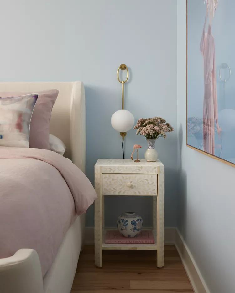
Calming Light Blue
For a restful retreat, light blue is a top choice for any bedroom. Haywood describes how this calming shade, combined with breezy, beach-inspired elements, creates a serene guest room that promotes relaxation and peaceful sleep.
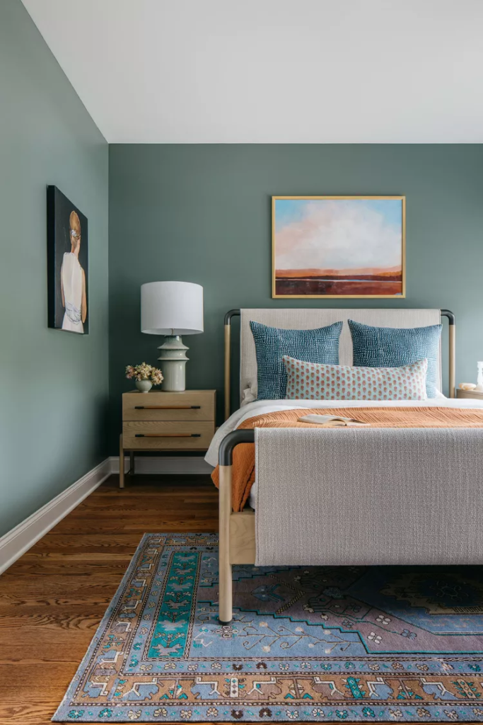
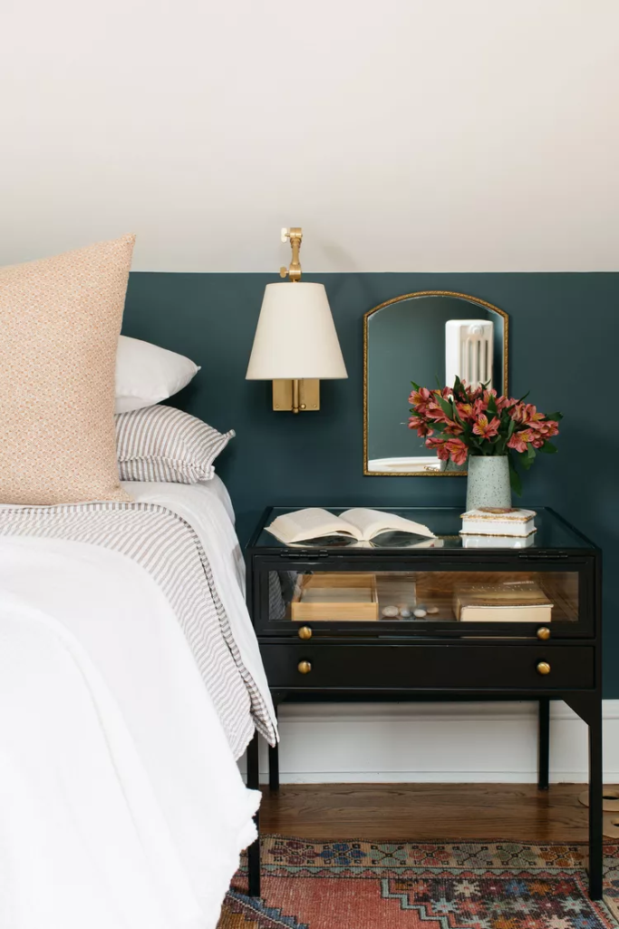
Deep Green
Make a bold statement with deep green, or focus on just one accent wall for a dramatic touch. Haywood notes, “We embraced the existing deep green accent wall and bedroom furniture, designing around them to create a space that fosters relaxation and calm.”
Blush Pink
Blush pink is a versatile choice for both children’s and adult spaces. Haywood chose Farrow and Ball’s Pink and Ground for its blend of “sweet and sophisticated” tones, allowing the color to adapt gracefully as a child grows.
Deep Blue-Gray
Introduce depth and intrigue with a dramatic blue-gray like Farrow and Ball’s Inchyra Blue. Haywood explains, “It appears almost black in shadow but reveals a rich, deep blue in natural light, adding sophistication and a touch of mystery.”
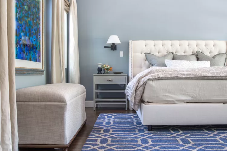
Neutral Blue
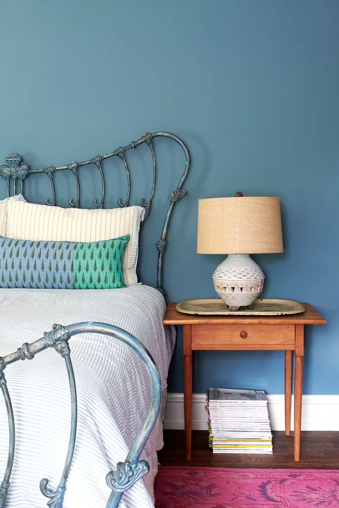
Benjamin Moore’s Newbury Port Blue offers a neutral blue tone that enhances relaxation and tranquility. Michelle Gage, owner and principal designer of Michelle Gage Interior Design, uses it to create a calming ambiance in guest rooms.
Classic White
For a bright, airy feel, Amy Peltier of Peltier Interiors opts for Benjamin Moore’s Chantilly Lace. This classic white paint pairs beautifully with statement wall paneling to create a clean and elegant look.
Icy Blue
Gage selected Benjamin Moore’s Polar Sky for its ethereal quality, aiming to make the room feel like “sophisticated clouds.” This cool, light blue creates a serene atmosphere in the main bedroom.
Creamy Off-White
Benjamin Moore’s White Dove is a timeless off-white that adapts well to various lighting conditions. Peltier uses this soft hue to provide a bright backdrop for gentle pops of color in the bedroom.
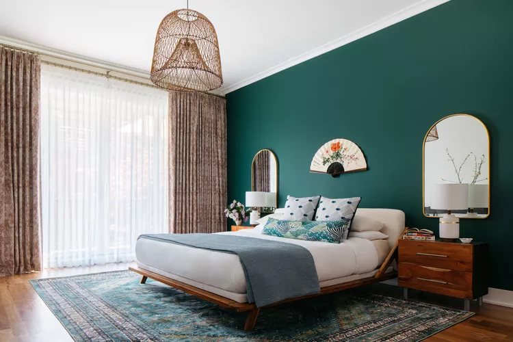
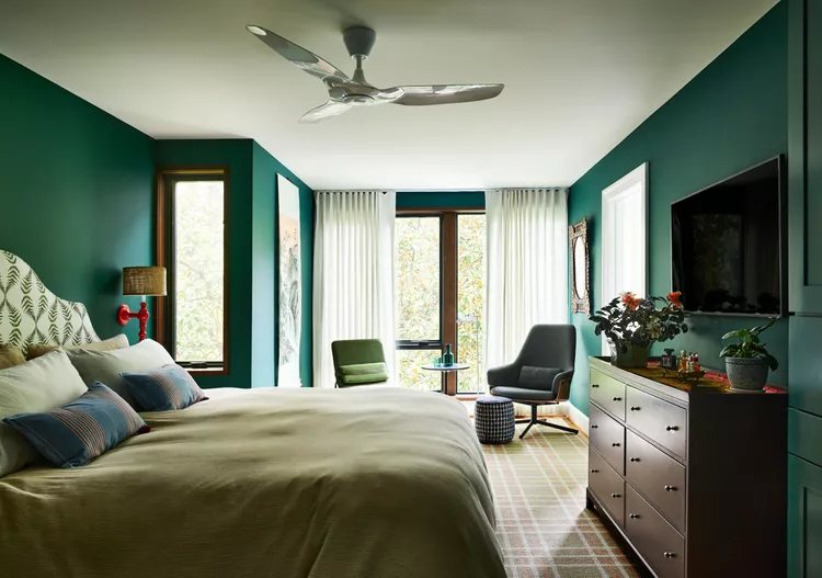
Hunter Green
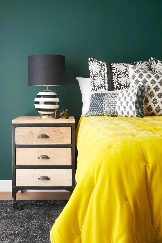
Hunter Green by Benjamin Moore creates a dramatic backdrop perfect for bold accents. Gage used this deep green to complement a chartreuse velvet comforter, adding a striking element to the guest room.
Bright Blue
To enhance the ceiling wallpaper, Gage chose Benjamin Moore’s Santa Monica Blue. This vibrant shade, ideal for a teen’s room, harmonizes with the ceiling design while maintaining a fun and dynamic atmosphere.
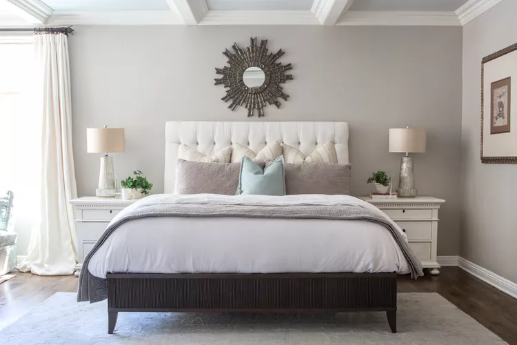
Iconic Gray
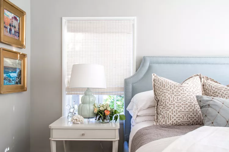
Benjamin Moore’s Revere Pewter is a versatile gray that blends cool and warm tones. It serves as a neutral base in the room, complementing a pale blue headboard and taupe-accented pillows with a subtle green lamp.
Dusty Blue
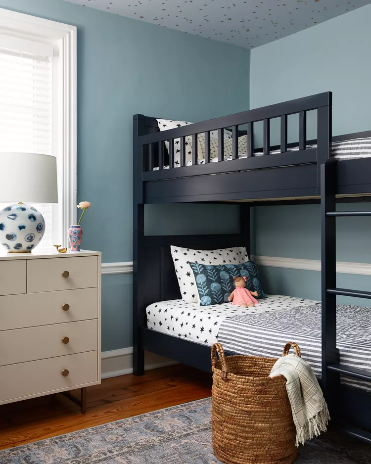
For a balance that complements ceiling wallpaper, Gage selected Benjamin Moore’s Colorado Grey. This dusty blue grounds the room beautifully and adds a sophisticated touch to the starry ceiling.
Subtle Blue-Gray
If you prefer a softer blue, consider Benjamin Moore’s Little Falls. This understated blue-gray offers a serene base, while stronger blue accents like patterned rugs and artwork enhance its subtle tones.
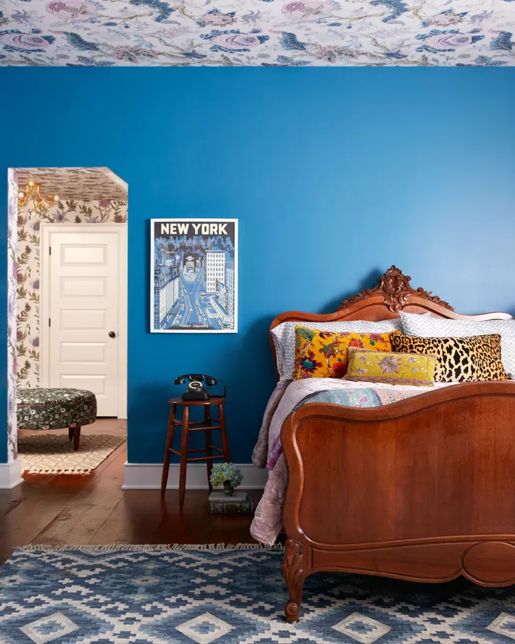
Dark Navy Blue
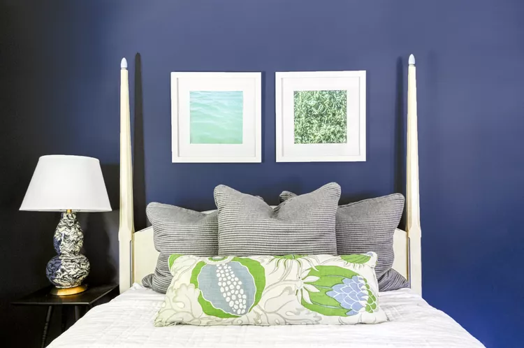
For a bold bedroom statement, Peltier used Sherwin-Williams’s Sea Serpent. The rich navy is balanced by a light four-poster bed frame and a patterned bedside lamp, creating a striking contrast.
Cool Gray
With its cool blue undertones, Benjamin Moore’s Wickham Gray offers a versatile base for layering neutral elements. Peltier chose this gray to complement a range of neutral tones in the bedroom.
Rainforest Green
Inspired by nature, Benjamin Moore’s Dragonfly creates a retreat-like atmosphere in the bedroom. Nicole Lanteri, owner and principal designer of Nicole Lanteri Design, notes, “This color evokes the essence of a treehouse, bringing comfort and a touch of luxury into the space.”
Calming Gray
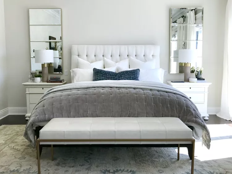
Benjamin Moore’s Calm provides a serene, neutral base that is softer than bright white. Peltier uses it in a bedroom, accented with metallics, mirrors, and deeper grays and blues to enhance the calm, tranquil ambiance.